

Two friends of mine are a Space Opera/ Military SciFi author and his wife Dot, the marketing half. She’s given me tidbits as I’ve gone on writing, cover art and marketing (And has offered me the cat discount on her marketing skills if/when I publish, which I jumped at because she’s been doing this awhile and knows her shit. A good writer takes advice.) Her and the rest of the Mad Geniuses’ posts on writing can be found here: http://madgeniusclub.com/navigating-from-writing-to-publication/
The below is taken from Dot’s blog here: http://wingandawhim.blogspot.com/2014/07/covers-cueing-genre-and-subgenre.html and I do not claim any credit for it, nor do I mean to violate copyright. Just want to share some invaluable advice.
#
The best way to get a feel for what your cover needs to signal is to look at your genre’s covers, discard the classics and the iconic covers with major push, and average the differences for cues. However, I’ve had lots of reminding the past few days that not everyone has the visual memory / visual processing / sufficient exposure to understand what I mean without more explanation. I’ve seen this before, in brand new home buyers trailing behind a home inspector / landlord / rehabber.
I can drive past a property, and wince. “Absolutely not.” “Why not? It’s pretty, has a big yard, is in our price range, and we haven’t even looked inside yet!” “You see how the roofline’s sagging? That’s major structural repair. And see the caulked lines on the downhill side of the house? That’s a cracking foundation, as it’s settling. I don’t care how pretty the kitchen and bathrooms are, that’s a money pit that’ll be less expensive to demolish and rebuild. What’s your next address?”
So, here’s my attempt to point out what I’m looking for when it comes to signals, so you can do it consciously. PS – you may have to turn off adblocker or noscript to get these to show, because it’s infinitely easier for me to link to an amazon-hosted image than to try to download all the images, upload all of them to picasa, and then link them all. Like you guys, but you’re not paying me to work that hard for your convenience.
Space Opera and Military SF have a fairly broad overlap; their Venn diagram has most of the the books in the center of both ranges. General rule #1: No photographs other than NASA images. Rendered and painted art is perfectly normal.

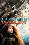
Classic ship + planet. “Exploding ship in space – you can tell it’s space because of the planet! Epic space battles! It’s Military Science Fiction – or Space Opera! (Check the blurb.)”

Classic planet. “Hi! It’s set in space! It’s science fiction with planetary scope! It’s Space opera!”

It’s an exploding ship in space – it’s military scifi! And hey, if you’re not on a mobile browser, look at the sidebar for some non-exploding ships in space, or with alien moons to signify it’s not earth! They’re space opera!
The number of sarcastic exclamation points is only partly because I’m still on my first cuppa for the day. It’s also because covers scream. They have to – as you’re skimming a bookstore shelf or a web page of search returns, there’s no time for a slow, gentle, subtle introduction. Nobody notices the wallflower – so the good ones tend to be jumping up and down screaming “Pick me! Pick me! Over here!”
It’s a space scene… and a person! It’s Space Opera! Okay, if the person is holding a gun or wearing military uniform/body armor, there’s still a good chance it’s military scifi.

For a note on typography – this could be a military thriller, or even a book on a historical battle, by cover art. Nothing really says military scifi… except that typography. That’s pure Baen, which screams from six feet away in a bookstore “I’m Baen scifi! My characters kick ass and take names with an awesome plot!”
On to post-apocalyptic fiction. Again, no photographs.

The nuclear explosion, biohazard and radiation symbols have been so overdone you’ll need a truly outstanding treatment to look attractive, but they can always be snuck in as an element of the covert art.

Epic paintings/rendering of ruins of modern civilization are pretty standard.

Also, there’s usually a a human against the ruins, walking toward or walking away. And, you’ll notice that most of these covers are fairly dark, or grungy.
Epic fantasy! Photographs are right out, and so are renderings. This needs to look like an oil painting. Yes, specifically oil.

You have three choices: landscape with guy with sword,

guy with sword,

or magnificent architecture (epic landscape.)
Why didn’t I mention the two biggest-selling epic fantasies? Because they’re the two biggest epic-selling fantasies, with multi-million dollar marketing campaigns and lots and lots of push.

This isn’t a very visible image in thumbnail, but with a TV show and lots of coop space (the tables at the front of the store), millions of occasional readers to non-readers know Game of Thrones. This very, very strong iconic branding means that you can spot it easily, and someone who doesn’t read SF&F but can’t wait for the next season of the tv show can walk in and instantly spot the book they want.
If you don’t have the push, I don’t recommend going for the indecipherable icon. Why not? Well, an unexplained little swoosh is instantly recognizable as a Nike product – but another unexplained little squiggle is just some knock-off no-name cheap Chinese athletic gear. So, too, an indecipherable cover icon “It’s a…helmet? maybe?” requires the background treatment and typography alone to carry genre, subgenre, and promises to the reader – and has to overcome “Oh, it’s a game of thrones knockoff.”
Now for two oft-confused subgenres with almost as much overlap as space opera and milscifi: urban fantasy and paranormal romance. The difference is that one is about kick-ass people in variants of modern-day with magic/fantasy tropes, while the other is a romance in an urban fantasy setting, with a “strong female lead” (sadly, usually the romances confuse bitchy, self-centered, and abusive with “strong.” Feminism, you have a LOT of damage to the culture to answer for.)

Guy who is not half-naked, wearing a noir-film remeniscent trenchcoat, firing gun while holding mystical-symbol staff: urban fantasy.

Woman facing the viewer, head visible, holding weapon (bonus points for it being primitive weapon.) Urban fantasy. Though it’s Mercedes Thompson, which like several other series started off as great urban fantasy, and has slid firmly into paranormal romance. A common feature / bug in the genre, and part of why it’s so hard to tell one from the other.

Woman facing away from the viewer / face not visible. Paranormal Romance! Bonus points for skin-tight clubbing gear, any hints of black leather, black latex. Points deducted for lack of weapon.

This one again works on the typography. Guy with sword: quest fantasy or urban fantasy? Grunge font – urban fantasy.
#
So that’s Dot. Yes, she’s that much fun in person too 🙂 And she’s our cat-sitter so there’s just a lot of love.
Happy Writing 🙂
Comments